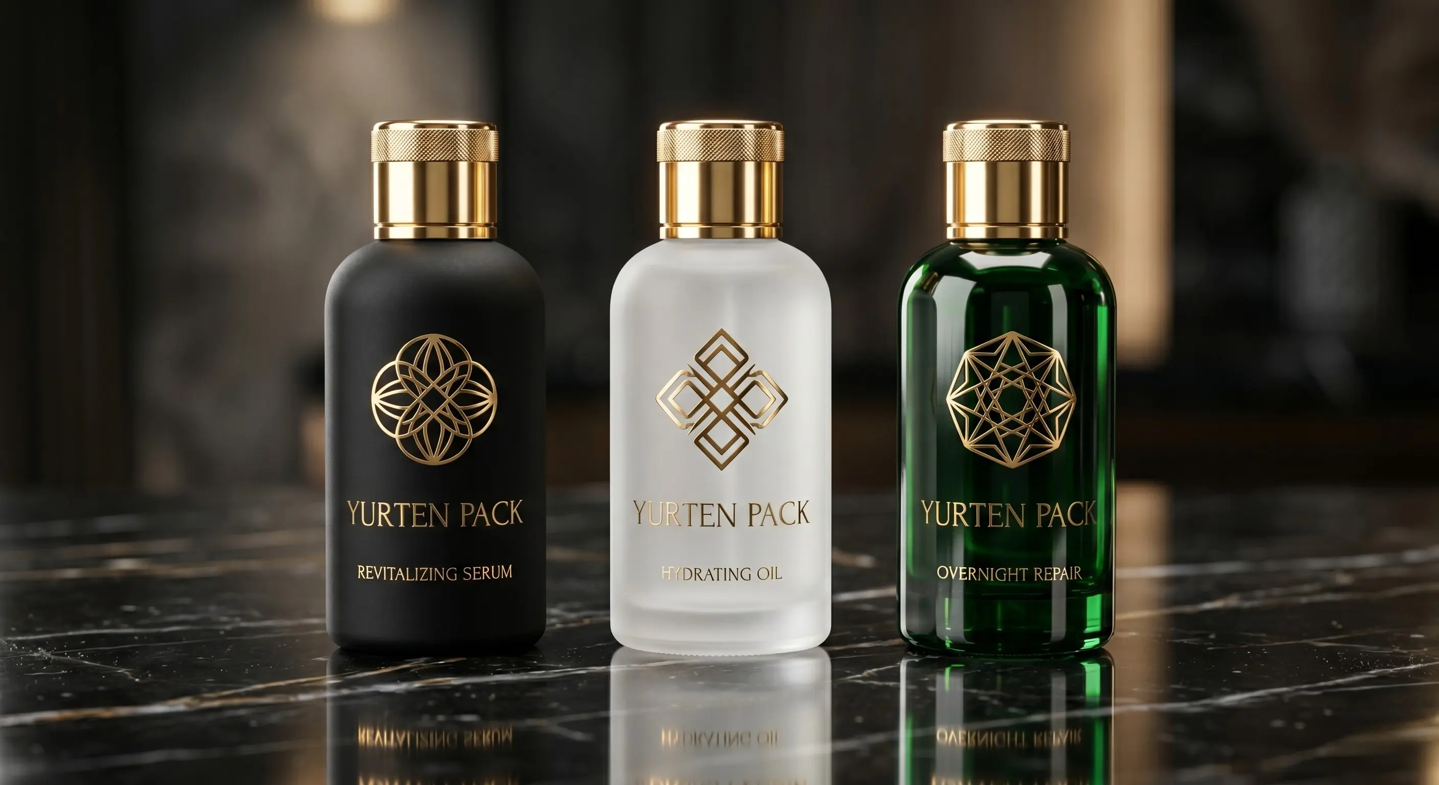
The prestige signal shoppers trust first is tactile. Before they read ingredient decks they register weight in palm, varnish drag on thumb, metallised edge catch in studio light.
If you still treat a perfume body as interchangeable once the liquid is bottled, reconsider: glass painting and kiln silkscreen are how indistinguishable catalog rounds become unmistakably yours. Walk through material choices the way our finishing floor sequences them.
Colour as brand dialect
Most wholesale glass programs start from identical clear shells. Divergence arrives when opacity, gradients, metallics, and soft-touch resins articulate who the product courts. Matte black telegraphs noir intensity; iced glass cues clinical serums without cold sterility.
Contract cosmetics launches hinge on marrying formula stability with emotional palette. Velvet lamination analogue finishes prolong counter engagement long enough for storytelling to convert.
Why pressure labels wilt where silkscreen endures
Labels lift at corners whenever solvent creep attacks adhesive. Perfume concentrates laugh at decals that were qualified on water-based mockups alone. Oven-fired inks migrate into glass microtexture - they shrug at alcohol vapour cycling through daily use.
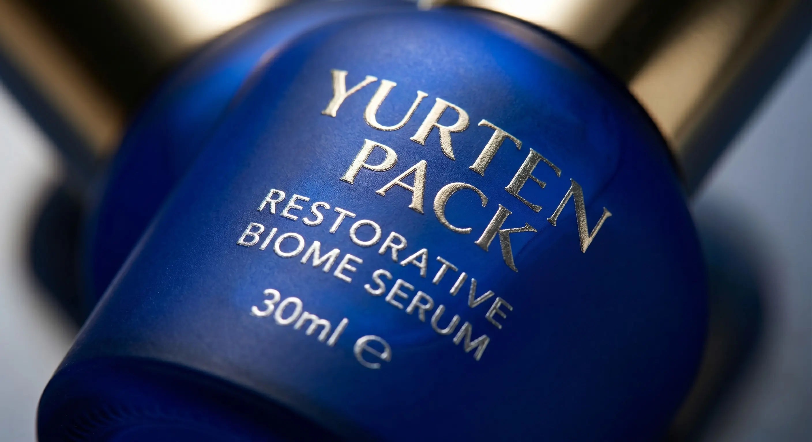
Metallic foils embossed through mesh read bespoke under macro photography - the influencer proof point many launches forget to budget until it is late.
Format-specific cues
Decorate per ritual: airless bottles favour restrained vertical typography so engineering surfaces stay readable. Heavy cream jars absorb opaque lacquer that telegraphs nighttime richness. Acidic serum bottles routinely spec UV-absorbing tints guarding actives between bathroom LED cycles.
Investment framing, not discretionary spend
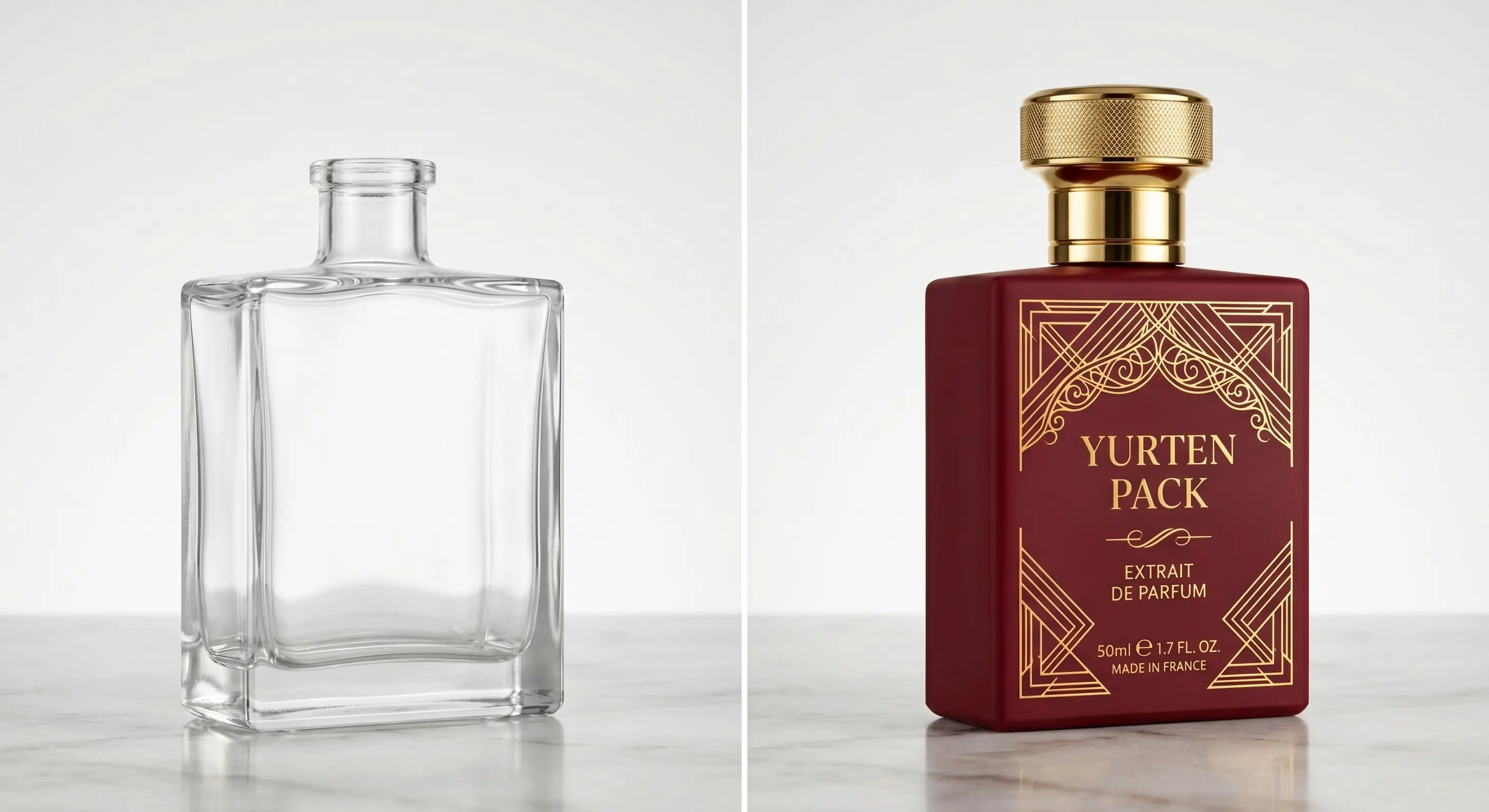
Deco amortises via higher realised ASP and lower retail markdown dependency. Consumers literally pay for objet confidence - the collectible bottle they keep rotated toward the vanity mirror.
"Packaging is not overhead; it is the first tactile promise you physically keep."
Yurten Pack finishing studio
Work with finishing as early as SKU architecture
Brief us while neck finishes are still movable. Harmonising gasket shadow bands, metallised shoulders, or registered multi-hit screens after tooling locks is exponentially pricier. If you crave runway differentiation, ping sales through the contact form with references and deco dreams so sampling slots stay ahead of retailer deadlines.